To see in color is a delight for the eye, but to see in black and white is a delight for the soul – Andri Cauldwell
For this week’s Lens-Artists Photo Challenge #70, we’re inviting you to explore the world of monochrome–which includes black and white and sepia, as well as different shades of one color.
For those of us who always shoot images in color, monochrome may seem dull at first. But it has many benefits. It can highlight texture in a shot–like these rough and smooth stones in St. Patrick’s Cathedral in Dublin.

Sainted at Saint Patrick’s, Dublin, Ireland
I think it’s because it was an emotional story, and emotions come through much stronger in black and white. Color is distracting in a way, it pleases the eye but it doesn’t necessarily reach the heart. – Kim Hunter
Monochrome can also add drama, mystery, and emotion to a shot–which is why I used it in this photo of the infamous Kilmainham Gaol in Dublin, where many rebel prisoners were killed during the Irish Uprising.

Kilmanham Gaol, Exterior, Dublin, Ireland
I’ve been forty years discovering that the queen of all colors is black. – Henri Mattise
Monochrome can also add old-world charm to your photos–like this shot of Roman rooftops–which could have been taken hundreds of years ago, instead of just last year. Monochrome also eliminates distracting colors. So, in this shot, the viewer can focus on the beautiful geometry of the domes and spires and various buildings.
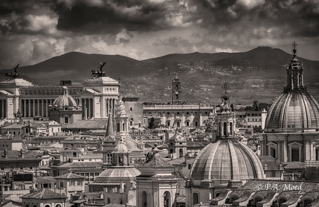
Rooftops, Rome, Italy
One very important difference between color and monochromatic photography is this: in black and white you suggest; in color you state. Much can be implied by suggestion, but statement demands certainty… absolute certainty.– Paul Outerbridge
Monochrome literally means “one color.” So, it also gives you the opportunity to explore different tones and shades within one color–in this case, yellow.

Sunburst
This week, we invite you to explore Monochrome for Lens-Artists Photo Challenge #70. You can include images in black and white, sepia, and/or different shades of one color. For an extra challenge, try adding a bit of color to a black and white image. In your post, include a link to this post. (Links from the Reader are not working correctly.) Use the Lens-Artists tag to help us find you. For instructions on how to join us, click here.
Thanks to all of you who participated in Tina’s fun “Seeing Double” challenge last week. I loved the variety and creativity of your responses to her theme.
Did You See These?
- Viveka treats us to some great doubles–even hamburgers.
- Raj shows us “When Two Is Company!”
- Ana at Anvica’s Gallery highlights “Seeing Double” in fire, smoke, and flowers.
Next week, our talented Ann Christine will host Challenge #71, so please be sure to stop by her site.
As always, Amy, Tina, Ann-Christine, and I hope you will join us. We thank you for your continued support of our photo challenge.
Categories: Lens-Artists Photo Challenge, Photography

Beautiful post Patti – love the expanded definition of monochrome to include a single color or better still, a monochrome image with a touch of color. Each of your images prove the importance of monochrome and it’s impact on the viewer. Well done!
LikeLiked by 2 people
Thank you, thank you! I’m glad you like the “expanded” theme! I’m curious to see what you come up with. Now I’m imagining those shaggy Scottish Highland cows in black and white with pink tongues. 🙂 🙂
LikeLiked by 1 person
LOL, now THAT would have been fun!
LikeLiked by 1 person
🙂
LikeLike
Oh Patti, what a fabulous topic you have for this week. I love monochrome in all the types of way you described and your photos are marvelous. 😀
Here is my entry for this week.
https://ceenphotography.com/2019/11/02/lens-artists-photo-challenge-70-monochrome/
LikeLiked by 4 people
Thank you so much, Cee. I’m always happy when you join us!
LikeLike
Ooh! I can’t wait to get started on my challenge submission. Big fan of Black-and-White!
LikeLiked by 2 people
That’s fantastic news, Johnbo. I can’t wait to see your post. I’ll look for your link here. 🙂
LikeLiked by 1 person
Ooooh, right up mŷ street, Patti! I actually posted a monochrome image earlier today, but will do the challenge tomorrow, perhaps….
LikeLiked by 2 people
Wonderful, Sue! No worries. I’ll be patient. Your posts are always a treat.
LikeLiked by 2 people
Thank you, Patti!
LikeLiked by 1 person
https://solaner.wordpress.com/2019/11/02/lens-artists-photo-challenge-70-monochrome/
LikeLiked by 3 people
Glad you joined us, Solaner!
LikeLiked by 1 person
😊
LikeLike
Excellent gallery of monochrome images. This is a favorite theme of mine…now to decide which direction to go… 😉
LikeLiked by 2 people
Thank you, Dawn! I’m so glad you like the Monochrome theme. Now you’ve got me wondering which direction you’ll go with this! Happy pondering!!
LikeLiked by 2 people
Wow, a great topic again … but I have to play around with my images. Never work in Monochrome. Thanks for the support for last week’s challenge, lovely!!!! Excellent gallery, Patti … I prefer that sunflower. Our world needs all the colors it can get. *smile
LikeLiked by 3 people
I’m so glad you like this one, Viveka! I can’t believe we’d had 70 challenges already! That sunflower is so cheerful, isn’t it? I’m looking forward to seeing your post. Don’t worry. There’s no rush!
LikeLike
Thanks, Patti … going to finish it off tomorrow. Going to Poland (Gdansk) on Monday to see the Sukhishvili Georgian National Ballet. Enjoy!!
LikeLiked by 5 people
It looks fabulous, Viveka. Enjoy!
LikeLike
that dance video was awesome Viveka
LikeLiked by 1 person
Yes … I wish I could dance like that. Thanks.
LikeLiked by 1 person
😊☀️
LikeLike
As usual, the horse knows the way: https://photographyocd.com/2019/11/01/a-look-at-november/
LikeLiked by 1 person
Oh, yes. The horse knows. 🙂 Glad you joined us, Mike.
LikeLiked by 1 person
A great set of monochrome photos taken from these two glorious cities, Patti. The rooftops in Rome is stunning.
Can’t wait to see the responses. 🙂
LikeLiked by 1 person
Thank you so much, Amy! They are marvelous cities, with long histories. I’m looking forward to seeing your post, too!
LikeLike
I am happy you choose mono as theme. I hope more photographers are falling for the magic of mono. And I can be part this week by publishing as always mono!
LikeLiked by 2 people
Hi, Chris. I knew you’d love this theme! I’ve always enjoyed your mono shots. Glad you’re joining us, too!
LikeLiked by 1 person
I will be snug in my comfort zone this week 🙂
LikeLiked by 1 person
Great post, Patti – and I love the expanded theme with one colour and the possibility of selective colours. The rooftops are my great favorites – but your choices are all perfect. Looking forward to seeing all entries now!
LikeLiked by 1 person
Thank you, Ann-Christine. I love your idea of adding a touch of color to the b & w shot. Great idea! Looking forward to seeing your post, as well.
LikeLike
Thank you, Patti! I love trying out the best colour to add for the photo.
LikeLiked by 1 person
hi patti very different and beautiful photos for the theme, I especially like the 1st, 3rd and 4th.
here is my post for weeks challenge, https://wp.me/p2AvI7-3jt.
greetings robert
LikeLiked by 2 people
Hi, Robert. Your images are beautiful. The delicate, silky textures really come through in monochrome. Thanks too for your thoughts on my images, too! Glad you like them.
LikeLiked by 1 person
That photo of rooftops in Rome is wonderfully detailed!
You can see a lot of the architectural effort that’s gone into designing them.
I think it feels like something akin to a pattern.
Here’s mine for this week:
https://stupidityhole.wordpress.com/2019/11/03/morning-river/
LikeLiked by 2 people
Thank you so much, SH. I agree. The detail really comes out in the monochrome. Glad you joined us this week.
LikeLike
A great challenge Pattie. I love the way your monochromes pick up the different textures.
LikeLiked by 1 person
Thank you, MM! I’m so glad this theme resonates with you. I hope you join us!
LikeLiked by 1 person
I certainly will
LikeLiked by 1 person
Love the rooftops of Rome, Patti. I seldom use black and white but can certainly see it’s impact. 🙂 🙂
LikeLiked by 1 person
Hi, Jo. Thank you! I don’t use it very often either, but when it works, it works! I love the effect. I hope all’s well with you. Has all your company left?
LikeLike
Well, I could say back to peace and quiet, Patti, but it wouldn’t be strictly true. 🙂 🙂 We were partying yesterday and much coffee is needed before I set off on this morning’s walk!
LikeLike
You’re ahead of us. 🙂 We’re going out for a very long walk after a lot of eating and drinking last night!!
LikeLiked by 1 person
Loved this one Patti! Thank you as always!! https://ichoosethis.blog/2019/11/02/lens-artists-challenge-70-monochrome/
LikeLiked by 2 people
You’re very welcome, Pam. I’m so glad you like this one! I’m looking forward to seeing your “take” on this one!
LikeLiked by 1 person
A great theme accompanied by magnificent examples.
And thank you very much for mentioning my post..
LikeLiked by 1 person
Aww, thanks, Ana! I’m glad you like the shots. You’re welcome, too, for the mention. It was a great post.
LikeLiked by 1 person
Hi Patty and everyone !
Here my entry !
Ciao Ciao
https://max510.com/2019/11/03/lens-artists-photo-challenge-70-monochrome/
LikeLiked by 2 people
Ciao, Max. Benvenuto. Sono contenta di vedere la tua foto questa settimana!
LikeLike
Well this this the first for me of this theme week! https://wp.me/paGem-6qN
I hope you don’t mind to put up seven? 🙂
LikeLiked by 1 person
Thank you, Chris. We love that you participate in the challenge! Seven is no problem!
LikeLike
Such an interesting theme!
https://anthropologist.wordpress.com/2019/11/03/lens-artists-photo-challenge-70-monochrome/
LikeLiked by 1 person
Hi, Marianne. I didn’t know you are a writer, too! It’s nice to meet someone who writes and enjoys photography. Glad you like the theme and you joined us!
LikeLike
Writing and photography — nice to meet a kindred spirit! Yes, I love doing both.
LikeLiked by 1 person
Ah .. Roma 🙂 Loved the rooftop shot.
https://www.f28iso100.com/2019/11/03/shisa/
LikeLiked by 1 person
Thank you, Smruti! You can’t beat that view of Rome! I love the mix of antiquity and modern day. I hope all’s well with you.
LikeLiked by 1 person
I’m good Patty, thanks for asking. Just struggling to keep up with posting regularly 🙂 By the way https://www.read2heal.com/ is my second blog where I pursue my other interest i.e. reading. If you ever get time, do check it 🙂
LikeLiked by 1 person
Thanks, Smruti.
LikeLike
Superb theme but I must tell you this was the most difficult one! Why? because it’s very difficult to choose a perfect monochrome! (at least for me) 😀
But then I understood why only advanced photographers go for monochrome/b&w shots. Because one has to plan before even click the trigger!
Thanks for the opportunity, Patti!
LikeLiked by 1 person
Very true, Raj. It was difficult for me, too.
LikeLike
Cheers for that! 🍻
LikeLiked by 1 person
Hi Patti, Here is mine. https://shareandconnect.wordpress.com/2019/11/03/lens-artists-photo-challenge-70-monochrome/
LikeLiked by 2 people
Thanks, Amy! I enjoyed your shots. The tunnel shot really works in monochrome.
LikeLiked by 1 person
Great idea for a subject and wonderful monochrome architectural photos! I especially like the rooftops of Rome.
Here is mine: http://www.travelways.com/monochrome-photography-along-my-travels/
LikeLiked by 2 people
I’m so glad you joined us, Tatiana. Your post is fantastic. And thanks too for your thoughts on my shots.
LikeLiked by 1 person
Wonderful examples Patti, I especially like what it does to the prison photo but the rooftops are amazing too. The more you look, the more you see.
LikeLiked by 1 person
Hi, Wendy. Thanks for your thoughts on my shots. I’m glad you like those two. True, there are layers to the Rome vista. So many different shapes and details appear the more you look. I love the architecture there. I’m so glad you shared your impressions.
LikeLiked by 1 person
This was such a great idea to explore the differences in these often-confused terms. And you know – for some reason I always refer to monochrome photography as greyscale even though I know in painting (or on color photos) it is one color variation – and not sure I can stop doing it – lol – but iw ill try
—
and in your post – so much to enjoy – but I really liked the way you showed textures/shades/architecture with the grayscale approach – esp the brick work – really see the variation
and here is my entry:
https://priorhouse.blog/2019/11/03/ashley-gill-art-in-grayscale-lens-artists-photo-challenge-70/
LikeLiked by 1 person
Thanks so much for your thoughts, PH! I think the term monochrome can be confusing and even misleading. The monochrome “palette” really does bring out the highlights in texture and light. I love how it conveys a mood, too. I’ll look at your post next. Thanks for joining us!
LikeLiked by 1 person
😊☀️
LikeLiked by 1 person
A great challenge, Patti! I liked your photo of rooftops best. An interesting variety of heights, shapes, and textures.
LikeLiked by 1 person
Thank you so much, SB. I’m glad you like that one. I love the architecture of Rome. I’m glad you’re joining us! I’ll look at your shot next.
LikeLiked by 1 person
Here’s my contribution https://bendbranches.com/2019/11/03/a-black-and-white-world-lapc/
LikeLiked by 2 people
Beautiful and creative post, Siobhan! I’m so glad you joined us.
LikeLiked by 1 person
Joining in, Patti, though I have mixed it with my usual format. Hope you won’t mind.
https://restlessjo.me/2019/11/04/jos-monday-walk-sao-bras-de-alportel-then-and-now/
LikeLiked by 1 person
Of course not, Jo! I’m so glad you joined us!
LikeLiked by 1 person
Beautiful shots, Patti 😁 Had to go with classics for mine: https://jezbraithwaite.blog/2019/11/04/classics-lens-artists-photo-challenge-70-monochrome/
LikeLiked by 2 people
The classics work perfectly for the challenge, Jez. Those cars are works of art. Thanks too for your kind words about my shots.
LikeLiked by 1 person
Great topic, Patti. Love the Rome rooftops!
LikeLiked by 1 person
Thank you, Sandy! I enjoyed your post as well.
LikeLiked by 1 person
Ohh, thank you for allowing shades of one colour as well, Patti. I love colour so much, but I did my best to keep each photo uni-coloured.
https://mexcessive.photo.blog/2019/11/04/l-a-pc-monomochrome/
LikeLiked by 1 person
Hi, Manja. I’m glad you interpreted the challenge in your own unique way! You always are so creative!
LikeLiked by 1 person
Thank you, Patti. 🙂
LikeLike
Here’s my contribution to Monochrome:
https://davidmsphotoblog.com/2019/11/05/lens-artists-photo-challenge-monochrome/
LikeLiked by 1 person
Beautiful post, David.
LikeLike
These snaps are certainly very wonderful, especially the sunburst 🙂
LikeLiked by 1 person
Thank you, Hammad! Glad you joined us! I appreciate your kind words.
LikeLiked by 1 person
This was such a great opportunity for me to learn more about monochrome & B&W – thank you Patti – it works to well with that Roman rooftop photo but especially the church detail
https://poetrypix.com/2019/11/05/bw-and-monochrome/
LikeLiked by 2 people
Fabulous post, Laura. You really show us the power and range of monochrome!
LikeLike
Beautiful images Patti, many thanks to you and the others for hosting this challenge xx
LikeLiked by 1 person
Thank you, Bren! And thanks too for adding your beautiful post!
LikeLike
Meaningful quotes and soulful photography.
There is monochrome and then there is chrome by google which reminds me of the colourful South African flag . My apologies for this non-monochromatic remark
LikeLiked by 1 person
No apologies needed. You made me smile!! I appreciate that! Thanks too for your kind words on the post.
LikeLike
That was the idea 🙂
LikeLiked by 1 person
Beautiful photos! I especially love the roof tops!
LikeLiked by 1 person
Hi, SV. Thank you so much. I love the architecture of Rome! I appreciate your thoughts.
LikeLike
Monochrome does set the mood – your photos are a fine example. The yellow flower is exquisite (I am a big fan of yellow flowers!). I also appreciate your description of monochrome photography – a fascinating lesson. 🙂
My contribution:
http://oneletterup.com/2019/11/05/monochrome-moments
LikeLiked by 1 person
Thank you, OLU! I am so glad this was interesting to you. I’m just sharing as I learn about these things! Thanks too for joining us this week.
LikeLiked by 1 person
You’re welcome. I enjoyed it 🙂
LikeLiked by 1 person
Hi Patti.. Could you check to see if my attempts to post are going to your spam folder. Thanks. Olga
LikeLiked by 1 person
Hi, Olga. That is strange! I wonder why the link isn’t posting. I’m including it here. https://odaciuk.wordpress.com/
LikeLiked by 1 person
I am so glad you posted, Olga. Your post is fabulous!
LikeLiked by 1 person
Thank-you, Patti. Very strange!
LikeLiked by 1 person
Hi Patti, I love this theme and your photos. Hmmm, if I have to pick, I’d pick Rome and sunburst. I may do two posts, not sure yet. This post is for color and I may be back with another post for black and white.
https://theshowersofblessings.com/2019/11/05/lens-artists-photo-challenge-70-monochrome-color
LikeLiked by 2 people
Hi, Miriam. I’m delighted you like the theme and those images. Your images really show the power of monochrome and the subtle shades within one color. Beautifully done!
LikeLiked by 1 person
Thank you for your comment, Patti!
LikeLike
Great post, Isadora.
LikeLike
These are all wonderful photographs, Patti. The dark sky over the rooftops in Italy looks ominous.
I hope you weren’t caught in a big storm. Great challenge this week. Enjoy my selections …
Isadora 😎
LikeLike
Beautiful shots Patti. I am keen on using monochrome, though haven’t done for a while so this gives me an opportunity to experiment on some very recent photos taken locally. I must admit I do like architecture in B&W.
Jude xx
LikeLiked by 1 person
Hi, Jude. I’m glad you’re joining us! I’ll look at your post next.
LikeLike
Here is my contribution: https://chava61photography.photo.blog/2019/11/06/lens-artists-photo-challenge-70-monochrome/
LikeLiked by 2 people
Hi Patti, I’m back with my B&W. https://theshowersofblessings.com/2019/11/06/lens-artists-photo-challenge-70-monochrome-bw/
LikeLiked by 2 people
Patti, I enjoy learning more about monochrome photography this week and realizing how more interesting some pictures can be when converted to black and white and then adding a little color! Thank you. Here is my post: https://mycolorfulexpressions.com/lens-artists-photo-challenge-70-monochrome/
LikeLiked by 1 person
That’s wonderful, Sylvia! I’ll look at your post next.
LikeLike
I’m adding a comment here, Sylvia, since the comment button isn’t working. These shots are gorgeous! You really used selective color beautifully!
LikeLike
Love this challenge! Your b&w shots are particularly moving. Here is my — rather belated — contribution https://zimmerbitch.wordpress.com/2019/11/08/monochrome/
LikeLiked by 1 person
Wonderful collection, Su! I really enjoyed your shots.
LikeLiked by 1 person
Love that you included all one color in your presentation of this challenge!
https://lindylecoq.com/2019/11/07/lens-artists-photo-challenge-70-monochrome-in-the-moment/
LikeLiked by 1 person
Beautiful collection, Lindy. I’m glad you like this challenge!
LikeLike
I really enjoyed this! So many images I considered, but oddly, New Orleans really captured me the most in the absence of its iconic colors… https://lauradenise.home.blog/2019/11/07/monochrome-photography/
LikeLiked by 1 person
Hi, Laura. I’m glad you joined us. New Orleans was a great choice.
LikeLiked by 1 person
(I think I’m going to have to play another round with colors in nature now, though…) 🙂
LikeLiked by 1 person
I couldn’t resist also working on a photo from Dublin based on your prompt: https://wp.me/p2owKx-1iJ
Cheers, Amy
LikeLike
We both were inspired by Dublin this week! Glad you joined us, Amy.
LikeLiked by 1 person
🙂
LikeLike
Splendid monochromes, Patti! Every detail stands out so well.
LikeLiked by 1 person
Thank you, Sue. I appreciate your feedback!
LikeLiked by 1 person
The rooftops is wonderful … so much happening! And that dramatic sky 👏
LikeLiked by 1 person
Well, finally here are my images for monochrome, Patti: https://suejudd.com/2019/11/09/lens-artists-photo-challenge-70-monochrome/
LikeLiked by 1 person
I love your collection of monochrome, Sue. Beautifully done.
LikeLiked by 1 person
Pleased you like these, Patti!
LikeLiked by 1 person
very nice
LikeLiked by 1 person
Hi Patti. I love that you included the yellow flower and clarified the definition of monochrome. Years ago I posted an all-sepia photo for a monochrome challenge elsewhere and the host blogger took me to task because it was not in shades of black and grey. Here’s my submission for this one
https://babsjeheron.wordpress.com/2019/11/16/beautiful-great-blue-heron-number-25-black-and-white/
Best, Babsje
LikeLike
These are so beautiful
LikeLiked by 1 person
Thank you so much, Becky! I appreciate that.
LikeLike
brilliant images Patti!! I l love monochrome!
LikeLiked by 1 person
Thank you so much, Cybele. I hope all’s well with you. I’ll check and see what you’re up to next.
LikeLike