Simply put positive space is the actual subject while negative space (also called white space) is the area that surrounds the subject. The latter acts as breathing room for your eyes. Too little negative space results in photos that are cluttered and busy with every element in the photo screaming for your attention. ~Nico Gooden
This week, our friend, Amy, has given us a wonderful theme for LAPC #114. She is challenging us to focus on negative space, which surrounds the subject and helps to highlight it.
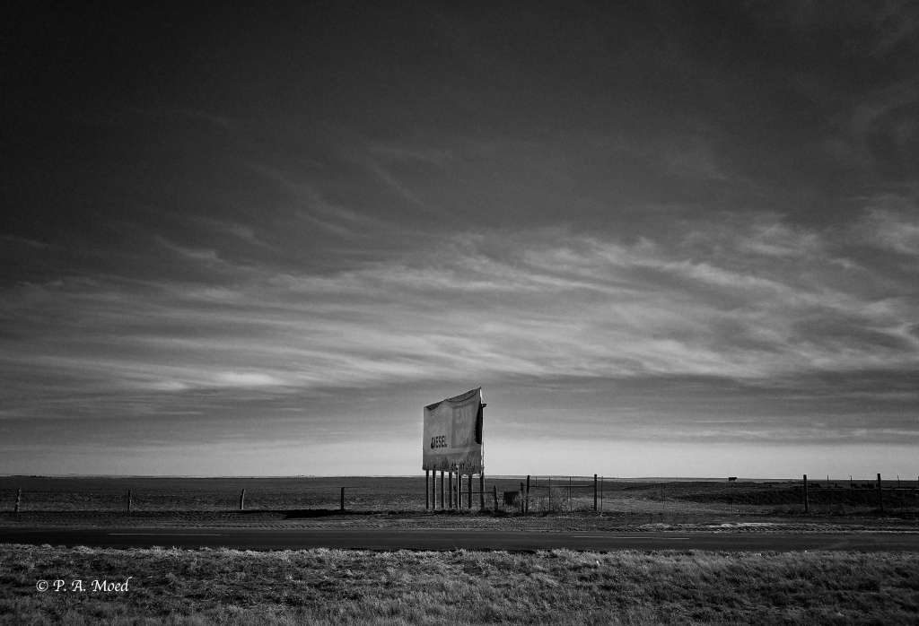
Fortunately, on our road trip from Michigan to California several years ago, we passed through New Mexico. One morning, we stopped in Albuquerque to have breakfast with friends who were traveling through the area at the same time. It was a great morning catching up with friends and enjoying the dramatic New Mexico landscape. I have to confess that I’m in love with the endless desert vistas in the Southwest. The sky seems to go on forever. All that negative space helps to create dramatic landscapes.
In both images below, the sky dominates the picture. As negative space, it serves to highlight the much smaller subjects–the sign and the farm. I processed both shots in black and white to accentuate the drama of the skies and to help create the mood of isolation and even loneliness.
Sign on the Road to Albuquerque
Abandoned Farm, Albuquerque, NM

A Foggy Day at Dee Why Beach
This next image was taken at Dee Why Beach, near Sydney Australia, on a rare foggy day. I processed the image in black and white and added a sepia filter, which helped to accentuate the foggy background and draw attention to the woman, sand and waves in the foreground. I was looking to create a dream-like atmosphere.

Frozen
I captured this image one morning on my way to the office on a bitterly cold day. As I parked my car and walked through the snow, I spotted the frozen remains of a summer flower. It looked sad and a bit pitiful–a perfect match for my mood on that winter day! The negative space (the vegetation) is a neutral backdrop, and doesn’t interfere with the flower in the foreground. In fact, it helps to focus the viewer’s attention on the flower.

Pine Tree Silhouette, Ordione State Park, New Hampshire
This last image was taken recently on a hike through Ordione State Park on a bright summer day. The sunshine in the background created a dramatic silhouette of a pine tree. The clouds in the background function as negative space, which helps to highlight the tree in the foreground.

A special thanks to Amy for hosting LAPC #114: Negative Space this week. Her theme had me thinking about how to use negative space when composing my photos. I really appreciate that! We hope you join us this week and share your photos which highlight negative space. Please be sure to include a link to Amy’s post and the tag “Lens Artists” so we can find you easily in the WP Reader.
And another big thank you to Rusha Sams for hosting LAPC #113, A Labor of Love last week. Her theme inspired a variety of interpretations and gave us a wonderful window into people at work around the globe. Some of you shared a few favorite projects, which are your labors of love, such as gardening, enjoying gourmet food, and playing music. Thank you, Rusha, for leading all of us!
Here’s our host schedule for the rest of September:
- Sept. 19 #115 Tina of Travels and Trifles
- Sept. 26 #116 Patti of P.A. Moed
In closing, I hope you can find a little oasis of peace and creativity amidst the crazy whirl of life! Take care and stay well.
Categories: LENS-ARTISTS, Lens-Artists Photo Challenge, Photography

I knew you would have wonderful examples for this one Patti and you did not disappoint! Loved your use of B&W to help create the mood in these beautiful images. My favorite is your poor little flower, as sad as you say, and also the NM sign, which is wonderfully evocative.
LikeLiked by 1 person
Thank you, Tina. I can’t believe I had those first two shots in my Google Photos file and never noticed them until a few days ago. What luck that they fit the challenge. I’m glad you like the processing in B& W. I thought it fit the mood I was trying to convey. Now I want to take another road trip out west again! Thanks, as always, for your thoughtful comments! They are always appreciated.
LikeLiked by 1 person
I love all of them!
LikeLiked by 1 person
Thank you, thank you!! I’m so glad to hear that!
LikeLiked by 1 person
Great and moving images, especially in black and white!
LikeLiked by 1 person
I was thrilled to find those first 2 shots in my Google photos file! What a pleasant surprise! Thank you, Anne, for your thoughts. I am looking forward to your post, too. I hope you can join us.
LikeLike
These are stunning!
LikeLiked by 1 person
Thank you so much, Cindy! I’m delighted you enjoyed them. I hope all’s well. Are the fires abating today? I really hope so.
LikeLike
These photos in all their simplicity are very appealing to my minimalist heart and mind.
LikeLiked by 1 person
Hi, SV. Thank you! I’m really encouraged to try a more minimalist style. It’s fascinating to reduce the image to the most essential components. I appreciate your thoughts/reaction. It helps me!
LikeLiked by 1 person
It is fascinating! I enjoy looking at your photos.
LikeLiked by 1 person
Big smile!!
LikeLiked by 1 person
I loved the loneliness of the house on the prairie and the sign. They are all evocative and mood-evoking.
LikeLiked by 1 person
Hi, Judy. Thank you! It does seem so lonely, doesn’t it? The vistas are so moving and dramatic. I’m glad you enjoyed them! I always wonder how I’d convey that loneliness in a piece of writing. Um…
LikeLiked by 1 person
I have a poem I wrote about an abandoned, isolated house. It, however, was in a stand of trees..
LikeLike
That would be beautiful. The trees could frame the house and serve as a barrier, too.
LikeLike
Fantastic images, Patti 👏 Love the vastness of the sky in the first two, stunning 😃
LikeLiked by 1 person
Hi, Jez. It is a stunning part of the USA, that’s for sure. I’m so glad you enjoyed them. Another road trip? I’m already thinking about one!
LikeLiked by 1 person
Arresting photos indeed Patti. The first one with a sign was straight out of a dystopian world. You are right, B&W really added drama to the shots.
LikeLiked by 1 person
Hi, Sheetal. I feel like we living in a dystopian world right now!!! Thanks so much. I’m delighted you enjoyed them. B and W felt right. I’m glad you agree.
LikeLiked by 1 person
I really like the use of monochrome in your photos. It seems to establish the mood and highlight your subjects. Lovely.
LikeLiked by 1 person
Thank you, Margaret! I was so happy I found these images last week. I was surprised how dramatic they were. Glad you agree that the monochrome works. It just felt right. I think it adds to the drama.😀
LikeLiked by 1 person
Wonderful black and white images, very well used. The first one is fantastic!
LikeLiked by 1 person
Hi, Ana. Wow. I’m delighted you like them. That first one is now my screen saver on my Mac! I hope you can join us this week.
LikeLiked by 1 person
Frozen looks like a bouket of flowers, Patti. Sorry, a certain letter on my keyboard doesn’t function. 🙂 🙂
LikeLiked by 1 person
Hi, Jo. I figured that’s what you meant! I’m having trouble with my keyboard too. Grr….. Thanks for your thoughts about “Frozen.” It does look like a bouquet! Glad you liked it. That’s what Michigan winters are like!
LikeLike
🤗💕
LikeLiked by 1 person
Wow those big skies of the open shots. Love them all.
LikeLiked by 1 person
Wonderful, MM! I’m delighted to hear that!! Thank you!
LikeLiked by 1 person
Marvellous images, Patti: the added drama of monochrome, those wide wilderness spaces (first two).
LikeLiked by 1 person
Hi, Tish. Many thanks! I’m delighted that you like them. I even got a compliment from my son!! I’m loving it.
LikeLiked by 1 person
Love those big skies! Going on a road trip next week and I hope to capture some big sky images as well. Nice collection of negative space images.
LikeLiked by 1 person
Hi, John. Aren’t those big skies wonderful? Where are you going? I hope you have some wonderful photo ops. Thanks for your kind words, John.
LikeLiked by 1 person
We are headed across Montana. Was originally planning all the way to the coast, but with the wildfires, we’re scaling that back. >sad<
LikeLiked by 1 person
I think you’re wise to avoid them. Enjoy your trip. I’ve never been to Montana. Great open sky country.
LikeLiked by 1 person
The mono coloured photos are perfect for this challenge! Beautiful!
LikeLiked by 1 person
Hi, Aletta. I’m so glad you agree that they were a good choice. I had fun exploring negative space this week. I hope you can join us, too.
LikeLike
I definitely will join you for the challenge, Patti
LikeLike
Excellent choice of monochrome, Patti! Setting the mood and refining the positive – and the negative spaces. My favorites are the flower and the abandoned farm this week.
LikeLiked by 1 person
Hi, A-C. Thank you! I’m glad you agree with monochrome for this one. That poor flower! The Michigan winters are so gray and cold. It just “fit” the mood! The farm was haunting, wasn’t it? I’d love to know the story behind it. Take care and have a good week. I hope it’s sunny and still a bit warm.
LikeLike
You take care you too, and yes, nice weather so far with quite a summery feel. Have a nice week!
LikeLike
Good choice to show these in black and white. I like how the clouds in the second picture dance above the barn.
LikeLiked by 1 person
Thank you, Siobhan. I appreciate your thoughts on them. The clouds are so expressive in that part of the country! I love it! I hope all’s well with you. Maybe you’ll join us this week?
LikeLike
You’re welcome! My main computer is barely working and I’ll buy a new one tomorrow and then get a post up. Too smoky to go out today.
LikeLiked by 1 person
The fires are really bad. The smoke is even bad up in Vancouver. Our son showed us what downtown Vancouver looks like today. Take care of yourself. And I hope you get all set up with a new computer soon!
LikeLike
I love the drama in these photos. The Australian one in particular intrigues me…where was she going? Is she an indigenous woman? Is she a tourist? I love it when a photo has me asking questions about the subject. So the use of negative space was perfect. I have focused entirely on the woman , the subject , of the photo!
LikeLiked by 1 person
Hi, Anne. I’m so glad you mentioned that one. I was wondering if it worked. The fog is tricky to capture. She is a bit mysterious, isn’t she? The beach was fairly quiet that day, which adds to the mystery. Thanks for your thoughts, Anne!
LikeLiked by 1 person
I think B&W can really accentuates feeling of negative space and your photos are perfect examples. I laughed when I read what you said about New Mexico. The West lends itself to these types of shots with the wide open sky and often not much else. Of course macro does the same which is why I was so happy with this challenge. 😉 Lovely entries.
janet
LikeLiked by 1 person
Hi, Janet. I’m glad you agree about the use of B&W. It also brought out more detail in the clouds. NM has gorgeous country, doesn’t it? True about macro…the subject dominates, too. Glad you enjoyed this one! I’m looking forward to seeing your photos.
LikeLike
I look forward to your visit. 🙂
LikeLiked by 1 person
I enjoyed it!!
LikeLiked by 1 person
Very dramatic photos.
LikeLiked by 1 person
Hi, Paulie. Thank you! I’m glad you think so!
LikeLike
Hi Patti, You nailed the use of negative space in these, especially in those vast landscapes. Excellent in monochrome. They make me yearn for a road trip.
LikeLiked by 1 person
Thank you, Jane. I’m delighted to hear that. I was so happy I found these shots. Now I’ll be on the lookout for other potential shots near my home. It is time for a road trip. I’ve been thinking of you and the fires. I hope the situation improves dramatically this week.
LikeLiked by 1 person
Thanks, Patti. Air quality is unhealthy. Today, I actually saw sun and some shadows, so maybe it’s improving. No outdoor activity so quite depressing, indeed.
LikeLiked by 1 person
Ohh…so sorry it isn’t getting better. Our son showed us photos from Vancouver. It is so smoky up there. The smoke is traveling north. Unbelievable. Take care. I hope you set up some air purifiers inside.
LikeLiked by 2 people
We do, thanks. Our friends and relatives in Portland are on high alert. 😦
LikeLiked by 1 person
wonderful pictures patti i like them very much, especially the 1st, 2nd and 3rd.
many greetings robert
LikeLiked by 1 person
Thank you, Robert! I’m delighted. I’m looking forward to seeing yours, too!
LikeLike
Hi Patti
What asn effective use of BW. You bring the road to Albuquerque in new light.
Here’s my submission. It’s a variation on your theme
https://babsjeheron.wordpress.com/2020/09/13/beautiful-great-blue-herons-the-eyes-have-it-quirky-artist-stories-nbr-17/
Best, Babsje
LikeLiked by 1 person
Hi, Babsje. I’m delighted that you like the shots from the road! I was delighted to find this “buried” treasure in my files earlier in the week! Take care and have a complete recovery!
LikeLike
Hi Patty. I’ve enjoyed your road trip to Albuquerque. Haven’t been there in 30+ years and I bet your scenes were present even back then. Best, Babsje
LikeLike
Great set of image with negative space, Patti! I love all of them! I have learned how the negative space can make such an impact from you, especially how it can isolate the subject. 🙂
LikeLiked by 1 person
Hi, Amy. Thank you! I was so happy to find these images in my files. Thanks to you, I’m also going to be more aware of negative space and deliberate when I use it in my photos. This was a great theme to open our eyes to the power of negative space! Take care and stay well.
LikeLiked by 1 person
These are beautiful and b/w really works well in the photos!
LikeLiked by 1 person
Hi, Nora. Thank you! I’m so happy with how they turned out. I appreciate your feedback, as always!
LikeLiked by 1 person
So glad you used black and white Patti. Conveys negative space well 😀
LikeLiked by 1 person
Thank you, Brian! I thought it worked, but I am so glad to hear that you and other people agree! I hope you are well!
LikeLike
Yes Patti quite well thanks 😀
LikeLiked by 1 person
Wow. Great examples. The first two are my favorites. Well done.
LikeLiked by 1 person
Thank you so much, John. I wish I had taken them with my Fuji! But still, it’s amazing how powerful smartphones are. I appreciate your kind words!
LikeLiked by 1 person
Beautiful images Patti and the black & white works so well with these spaces. I especially love your capture of the foggy beach 💛 xxx
LikeLiked by 1 person
Hi, Xenia. Thank you! I guess I’m not surprised you like the shot with water in it! You do love the beach! I hope all’s well with you.
LikeLiked by 1 person
Thank you Patti, all’s well here and hope you are keeping safe and well too 💛 xxx
LikeLiked by 1 person
These are all stunning images, and work so well in b&w
LikeLiked by 1 person
Hi, Su. Thank you, thank you!! I’m delighted to hear that. I hope all’s well with you and you join us this week.
LikeLiked by 1 person
Thanks Patti. Yes, I am feeling better and will look through my archive for some images I think might fit the challenge.
LikeLiked by 1 person
Love the ‘frozen’,the negative space with blur adding the pleasantness.Thank you Pattimoed.All clicks are stunning
LikeLiked by 1 person
Wow, thanks so much, PTP!!
LikeLiked by 1 person
Really love that farm, Pattie!
LikeLiked by 1 person
🙂. Thank you, Sandy!
LikeLiked by 1 person
All of your selections ooze a powerful feel to them. The sky in the second photo is ominous.
I LOVE them all. You captured the challenge perfectly. Five stars for this week’s photographs.
Have a wonderful week … Be Safe
Isadora 😎
LikeLiked by 1 person
Awww…..thank you, Isadora!! (Big smile). I’m delighted to hear your reaction. 5 stars!! I’m thrilled. Thanks too for your good wishes. I hope you are safe and healthy, too.
LikeLiked by 1 person
Fabulous photos, especially the first two with the open sky. I like the use of the black and white too. And funnily enough I have walked on Dee Why Beach though not in the fog! Again, great use of monochrome.
LikeLiked by 1 person
Hi, Jude. So you’ve been to Dee Why! Wonderful! Everyone said the fog was very rare. The beaches around Sydney are amazing. I loved them. I’m so glad you like b & w in these shots. It seemed to be the right choice. Take care and be well!
LikeLike
My son lived in Dee Why in 2014. I can’t believe that it is 6 years since I last visited Australia.
LikeLiked by 1 person
What a great spot to live! Where is he now?
LikeLike
Brisbane, via Perth for a couple of years and then southern suburbs of Sydney.
LikeLiked by 1 person
Too bad he’s so far away. You must be like me–missing your son!
LikeLike
We usually see him every couple of years as he would fly over to Europe, but 2017 was the last time.
LikeLike
Oh, that’s so hard, Jude. I’m sure you rely on Skype/Zoom calls a lot.
LikeLike
Patti, such lovely examples of negative space. I like seeing them in black and white, especially Frozen. Think it makes for a more dramatic look.
LikeLiked by 2 people
Hi, Sylvia. Thank you! I agree that b & w adds drama. That poor little flower. I always think of that image when it gets really cold! I always appreciate your thoughts and hope all’s well.
LikeLiked by 1 person
stunning images, Patti! especially the foggy at the beach! it is beautiful! 🙂
LikeLiked by 1 person
I’m so glad you like them, Wilma.😀. The beach was so eerie in the fog. Glad that came through! Take care and stay well.
LikeLike
That line tree photo is so original and just extra cool!
The frosty flower is also cool (pun intended)
And Just love your selections overall.
—
And the opening Nico Gooden quote was good but I slightly disagreed with the Ending
“Too little negative space results in photos that are cluttered and busy with every element in the photo screaming for your attention”
It seems to place a value judgement on photos that had too little negative space – by saying it was cluttered and busy was a little slanted-
Sometimes we call
That “rich” and full
Or we call it vibrant and not screaming – but loud and bold and captivating –
So I think it comes down to “different” and depends on the mood
Not to over chat it up here – but the cluttered word is what I liked least – too subjective
–
LikeLiked by 1 person
Thanks for your thoughts, Yvonne! I’m delighted you like those shots. I think it’s true that as long as the subject in the photo is clear a little clutter is fine. Too much would “drown” the subject, unless of course your subject was “chaos!” I’ll have to look more closely at some photos I like and see if that idea “holds up.” Interesting thought! Thanks for giving me that idea to investigate!
LikeLiked by 1 person
Beautiful monochrome images, Patti.
LikeLiked by 1 person
Thank you, Rupali!! I appreciate that.
LikeLiked by 1 person
I really enjoyed your choices. The black and white editing nicely accentuates the contrast – love the shots with all that sky. The survivor flower is my favorite though 🙂
LikeLiked by 1 person
Thank you so much, OLU! That little flower was popular this week. We have had our second week of cool temperatures. Winter is coming!! Take care and stay well.
LikeLiked by 1 person
You’re welcome. Yes, the cooler weather is upon us here in the northeast. Fine with me 🙂 You take care as well.
LikeLiked by 1 person
That poor little flower is popular this week! I always think of that image when it gets really cold. I’m getting ready for the New Hampshire winter–mentally at least! It’s been 10 years since we lived here, so we’ll see how it goes. I hope all’s well with you. Take care and stay well.
LikeLike
Lovely images for this weeks theme and I really like that you that you chose b/w, it makes them very special, even though I myself often prefer pictures in color. The second and third are my favorites.
LikeLiked by 1 person
Thank you so much, Anita. I’m delighted that you like the b/w images. I am trying to use b/w more. Like you, my “default” is always color! Glad you shared your thoughts!
LikeLiked by 1 person
Love your use of monochrome, to create a dynamic, negative space without color, to enhance the mood of each photo. The beach scene and frosty plant are so eye-catching. ❤
LikeLiked by 1 person
Thank you, Olga. I’m delighted to hear your thoughts on them. Take care and stay well.
LikeLiked by 1 person
Wonderful … b&w does this so well! Thanks for sharing ..
LikeLiked by 1 person
Thank you, Julie. I’m glad you enjoyed it.
LikeLiked by 1 person
Outstanding examples of negative space, Patti. And I like the b/w treatment. My favorite is the abandoned farm.
LikeLiked by 1 person
Thank you so much, Sue. I was delighted to find those shots deep in my files!! I am definitely going to do more of those type of shots. Glad you like them, too.
LikeLike