One very important difference between color and monochromatic photography is this: in black and white you suggest; in color you state. Much can be implied by suggestion, but statement demands certainty… absolute certainty.” – Paul Outerbridge
Here’s my experiment this week using a simple color palette. I selected a shot of an African power figure taken in the Museum of Fine Art in Boston.

African Power Figure from the Museum of Fine Art, Boston.
This nikisi or power figure, made of metal, leather, beads, skin, fur and fibers, protected the well-being of the Songye community in an area presently within the Democratic Republic of the Congo. The limited use of color in the statue is very effective and powerful. Its life-like quality makes the image rather startling.
I was also surprised by the use of metal in this sculpture and the fact that the figure was a protective spirit, rather than a destructive one. In this community, the ritual maker or shaman would consecrate the figure and renew the power of the medicinal and sacred objects that were packed inside it.
I wondered if the image would be as powerful in black and white.

African Power Figure in Black and White.
I think you’ll agree that it is far less interesting and has less visual impact. Next, I decided to keep it black and white, but add a pop of color to the metallic object in the figure’s hands. I selected the paint brush tool in Photoshop, picked a light blue color and chose an opacity of 35.
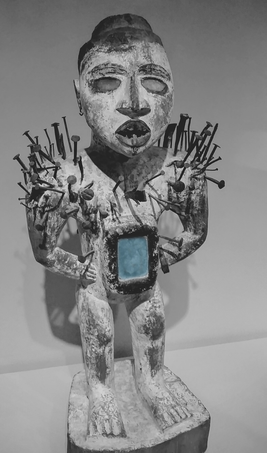
African Power Figure from the Museum of Fine Arts, Boston. With Blue Accent Colors.
Does this make the image more interesting? Or, mysterious?
Now, here’s the same shot with the lips accented. The effect is totally different. Once again, I think this makes the image more interesting with the focus on the figure’s face and its human attributes.

African Power Figure with Red Accents from the Museum of Fine Art, Boston.
In the end, I think the original shot is far more effective than all 3 black and white images. Do you agree?
This little experiment shows how difficult it is to convey intense feelings and power in black and white unless you can masterfully capture texture, and gradations of light and shadow. Black and white can be more subtle as the quote by Paul Outerbridge states. Sometimes subtlety fits the subject and scene and other times it simply lacks the power and punch of color–as in my black and white example.
In closing, I’d like to share with you an illustration by the writer and artist, Chris Van Allsburg. (You may remember his children’s books The Polar Express and Jumanji, which were also made into movies.) A recent exhibit of his drawings at the Grand Rapids Art Museum featured one of his illustrations from his children’s book The Mysteries of Harris Burdick. Even though Van Allsburg uses mostly sepia tones, the drawing has a powerful effect because of its shading, lighting, and subtle gradations of color.
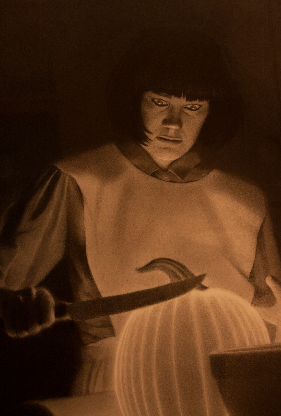
Chris Van Allsburg. Grand Rapids Art Museum, Grand Rapids, MI
I hope you enjoyed my little experiment. And have a great week everyone!
To view other monochromatic images, click the links below:
- https://dailypost.wordpress.com/dp_photo_challenge/monochromatic/
- https://travelsandtrifles.wordpress.com/2015/09/13/monochromatic-weekly-photo-challenge/
- https://lauracooperphotoblog.wordpress.com/2015/09/14/weekly-photo-challenge-monochromatic/
- https://ileanapartenie.wordpress.com/2015/09/13/weekly-photo-challenge-monochromatic/
Categories: Photography

Great quote in combination with your set of images–enjoyed your various processing techniques for the monochromes. The original is its own monochromatic delight.
LikeLiked by 1 person
Thanks, Sally! I had fun with this. So, we both agree the original is the most powerful!
LikeLike
Indeed…
LikeLiked by 1 person
Dat being one very cool experiment, ma’am!
LikeLiked by 1 person
So glad you enjoyed it, Rajiv! I’d like to do more in the future. I know you enjoy experimenting too.
LikeLiked by 1 person
I do enjoy experimenting. That is one way I am trying to push myself creatively
LikeLiked by 1 person
Me too. 🙂
LikeLike
Interesting and good learning.
LikeLiked by 1 person
Hi Leya. Thanks so much! So glad you liked it.
LikeLike
I love the first image Patti. Is that’s the 50mm? It looks so sharp!!!
LikeLiked by 1 person
Believe it or not, I took it with my Samsung phone through a display case. So glad you like the image, Maria!
LikeLike
It’s so sharp Patti; camera phones are taking over, I think!
LikeLiked by 1 person
My little Samsung has more megapixels than my old Canon 40D. Shocking, isn’t it? I think we are in the middle of a camera revolution.
LikeLike
Hi Patti … wow! what an arresting image! the nails are a nice touch, and I’m wondering if that rectangular gap in the belly area is a place to put your iPhone! Nice take on the theme!
LikeLiked by 1 person
Hi Stephen. I think that’s a perfect place for the iPhone. 🙂 It’s a sacred object for many people, don’t you think??
LikeLike
Thank you for sharing that quote, Patti. What a great post. I remember taking a painting class where we could use only black and white on the canvas. The point was to teach us how tone can alter the mood of the subject and how painting is about capturing light. I suspect a lot of those theories apply to photography also.
LikeLiked by 1 person
Absolutely, Jackie! I think photographers are always on the lookout for the light and how the shot captures a mood. I think in writing too we’re conveying mood and tone through our word choices and the cadence of our prose. It’s interesting to compare the two mediums, don’t you think? Are you still painting?
LikeLike
I agree with you, I like the original best, I do however, think it is good to experiment with these things.
LikeLike
Absolutely, PJB! It’s instructive and fun.
LikeLike